part 1: the problem
for the initial part of developing sneeders, i was doing so in RPG MAKER MV: a fucked up evil engine that i love a lot, but had to part ways with. you see, i have a particular venom towards MIXELS (that is, differing resolutions of pixel art on the same screen). to keep it short, rpg maker gets a little funny when your game isn't the default resolution, and that can cause some issues, particularly with UI scaling, and your FONT, and these issues cause weird artifacting and MIXELS. in any case, since moving to GODOT, my game's screen resolution is around half of what it used to be. this means that my previous choice of font, VCR OSD MONO, was suddenly way too large, and unable to scale down without artifacting. (i probably wasn't going to stick with it anyhow)
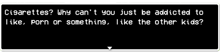
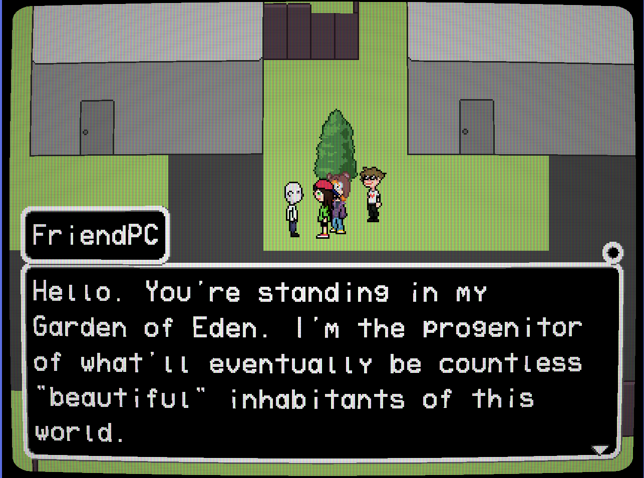
VCR OSD MONO, as seen in old RPG Maker versions of the game ^
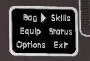
when i initially moved to GODOT, i just chose a font that worked fine enough and didn't look like shit, and what i went with was actually TERMINAL GROTESQUE, the font that this very website uses. great font, i love it. it did not look very good in-game though, but it was like, fine, temporarily, i guess.
TERMINAL GROTESQUE, artifacted from scaling too small ^
and eventually that started to piss me off too. i looked around for more fonts, but nothing i could find really fit the vibe i was looking for while being small enough to work with my resolution. i had to take matters into my own hands and make my own font.
part 2: what i was going for
i intially chose VCR OSD MONO because it coincided well with the motifs of my game. VCR OSD MONO is a "techy" font without veering into being futuristic or spacey. it evokes memories of VCR interfaces and EAS messages from analog television. sneeders has a lot of motifs centered around things like that: television, radio, and the internet.
i wanted a font that's similarly evocative of "technology," but a little idiosyncratic. something that feels slightly off, like it's hand-written.
part 3: the first attempt
after poking around a little bit for "PLS HOW 2 MAKE FONT NO ADOBE ILLUSTRATOR NO AI 2025," what ended up working best for me was this browser-based tool. YAL's PIXEL FONT CONVERTER was intuitive enough that even an idiot like me, who isn't a graphic designer at all, could make a font. big shoutout. so, after a few hours designing glyphs, what did i end up with..?
it fucking sucks!!!!!!!!!
part 4: the second attempt
okay yeah, i didn't realize how much smaller my glyphs actually needed to be. i had to completely ditch that entire font (which is fine: it didn't look that good) and create a new one from scratch. and what i ended up with was this: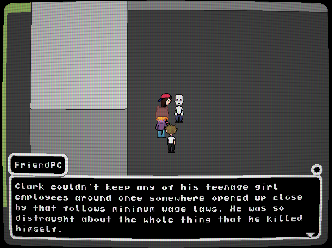
well that's like, serviceable i guess. it's not a perfect font, but it's mine. that'll probably be a running theme for this game's development, and i'm okay with that, i think.
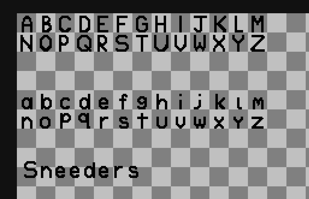
i've decided to call the font TELEPATH MONO, after the fact that Sneed, the progonist of my game, has telepathic abilities. it's a monospace font, like VCR OSD MONO. here's a demo of it:
AEIOU JOHN MADDEN JOHN MADDEN AAAAAAAAAAAAAAAAAAAAAAAAAAAAAAAAAAAA SNOO PINGAS USUAL I SEE?? I'M WORKIN ON IT!!!!!!! I'M WORKIN ON IT!!!!!!
AEIOU JOHN MADDEN JOHN MADDEN AAAAAAAAAAAAAAAAAAAAAAAAAAAAAAAAAAAA SNOO PINGAS USUAL I SEE?? I'M WORKIN ON IT!!!!!!! I'M WORKIN ON IT!!!!!!